T-Shirts?

Here's the place to discuss Vintage Hiwatt Conventions; past, present & future!

Moderator: Mods

User avatar
mikhailwatt
Posts: 858
Joined: Thu Nov 15, 2007 2:46 am
Location: Austin TX

Post by mikhailwatt »

Dr.HIWATT wrote:Can we use your graphic for the VintageHIWATTConvention.com Home page?
Sure... :? It was just a quickie cut & paste job... "borrowed" the logo from Mark's page and the Townshend stacks from one of the Who sites. :? :wink:

I'll send the "final" product when it's ready.
You can almost feel the current flowing
You can almost see the circuits blowing
User avatar
Dr.HI-TONE
Site Admin
Posts: 2675
Joined: Wed Nov 14, 2007 8:51 pm
Location: HIWATT Valley

Post by Dr.HI-TONE »

Excellent!


8)
http://www.HI-TONE-Amps.com

HI-TONE, when only the best will do.

DR-F
User avatar
OldSchoolDave
Posts: 2060
Joined: Wed Nov 14, 2007 9:24 pm
Location: HP, NC USA
Contact:

Post by OldSchoolDave »

mikhailwatt wrote:I'll send the "final" product when it's ready.
Send it over my way, mikhailwatt (I've been doing the modest web stuff to date).

One suggestion: Since this is an International Conference and all ;) , perhaps USA should follow the Columbus, IN ?

Dave
...Hey! I played that song when it was new...

http://www.OldSchoolDave.com
User avatar
mikhailwatt
Posts: 858
Joined: Thu Nov 15, 2007 2:46 am
Location: Austin TX

Post by mikhailwatt »

Please post your suggestions as to what info you think should be included... trying to keep it clean-looking without leaving out any pertinent info.

Dates? USA? Clayton's Basement? (party time, excellent!) :wink: :lol:

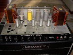
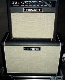
Are we in agreement on the basic concept? Let me know if you'd like to see something a little different. My first draft had a large roman numeral III in the background (3rd annual, wink, wink) but my brother had the great idea to use three HIWATT stacks instead... :idea: :idea: :idea:

Dr. Hiwatt/Mr. Fane suggested (and I think I like it) putting the design on the back, with a HIWATT logo @ the front pocket area.
You can almost feel the current flowing
You can almost see the circuits blowing
User avatar
Dr.HI-TONE
Site Admin
Posts: 2675
Joined: Wed Nov 14, 2007 8:51 pm
Location: HIWATT Valley

Post by Dr.HI-TONE »

I like the idea of the big graphic on the back and a smaller logo on the left front pocket area.

For copyright reasons the front shoul probably have the script "vintage" and "convention" sandwiching the HIWATT badge.

the dates could be on the back, or atleast "June 2008, Columbus Indiana USA"

I don't know that I would mention the Basement. If it looks like it will be a big turnout, I will make arrangments for a building at the fairgrounds.

I hope to have the deck and patio rain proof before then. :D
http://www.HI-TONE-Amps.com

HI-TONE, when only the best will do.

DR-F
Mike B.
Posts: 265
Joined: Mon Nov 19, 2007 4:24 pm
Location: NYC (Spiritually)

Post by Mike B. »

Dr.HIWATT wrote:I like the idea of the big graphic on the back and a smaller logo on the left front pocket area.

For copyright reasons the front shoul probably have the script "vintage" and "convention" sandwiching the HIWATT badge.

the dates could be on the back, or atleast "June 2008, Columbus Indiana USA"

I don't know that I would mention the Basement. If it looks like it will be a big turnout, I will make arrangments for a building at the fairgrounds.

I hope to have the deck and patio rain proof before then. :D
Yes, the big stack picture should go on the back with the smaller one on the left front breast (can we say "breast" here?). By all means include "vintage" and "convention." No mention of "basement."

Here's hopin' we also have pickled herring at the convention!!!

Mike
"Nowadays if you're the young man...."

Support Commercial Free Conventions
User avatar
OldSchoolDave
Posts: 2060
Joined: Wed Nov 14, 2007 9:24 pm
Location: HP, NC USA
Contact:

Post by OldSchoolDave »

mikhailwatt wrote:My first draft had a large roman numeral III in the background (3rd annual, wink, wink) but my brother had the great idea to use three HIWATT stacks instead... :idea: :idea: :idea:
I think the concept is GREAT! My only comment was adding the hosting Nation (and, maybe, spelling out Indiana).

Guess we'll have to bulk up before to many more conventions take place and we run out of room to display full stacks :D !

Dave
...Hey! I played that song when it was new...

http://www.OldSchoolDave.com
User avatar
Dr.HI-TONE
Site Admin
Posts: 2675
Joined: Wed Nov 14, 2007 8:51 pm
Location: HIWATT Valley

Post by Dr.HI-TONE »

the 3 stacks is a great idea!

I can't wait till June!

8)
http://www.HI-TONE-Amps.com

HI-TONE, when only the best will do.

DR-F
User avatar
mikhailwatt
Posts: 858
Joined: Thu Nov 15, 2007 2:46 am
Location: Austin TX

Post by mikhailwatt »

Mike B. wrote:(can we say "breast" here?)
I suppose... "man-boob" is off limits, however. :shock: :lol:
You can almost feel the current flowing
You can almost see the circuits blowing
User avatar
HIWATTuser1
Posts: 34
Joined: Wed Nov 14, 2007 9:51 pm
Location: North Carolina

T shirts

Post by HIWATTuser1 »

How about something on one or both sleeves like a SA-212, and a rear s/n plate with the particulars on it ie: place, date, times, and , of course, DR-405 on it

All cotton black

Also, some medium shirts please
User avatar
mikhailwatt
Posts: 858
Joined: Thu Nov 15, 2007 2:46 am
Location: Austin TX

Post by mikhailwatt »

Black, of course! I'll have a few size "M" done as well.

Printing on the sleeves would make them extra spendy... but I really like the s/n plate idea!
You can almost feel the current flowing
You can almost see the circuits blowing
User avatar
Dr.HI-TONE
Site Admin
Posts: 2675
Joined: Wed Nov 14, 2007 8:51 pm
Location: HIWATT Valley

Post by Dr.HI-TONE »

I like the serial plate idea too!

maybe in the spaces for model and serial # it could say JUNE and 2008
http://www.HI-TONE-Amps.com

HI-TONE, when only the best will do.

DR-F
User avatar
mikhailwatt
Posts: 858
Joined: Thu Nov 15, 2007 2:46 am
Location: Austin TX

Post by mikhailwatt »

Dr.HIWATT wrote:maybe in the spaces for model and serial # it could say JUNE and 2008
What do think about having the s/n plate @ the left "breast" area instead of the HIWATT-ish logo?
You can almost feel the current flowing
You can almost see the circuits blowing
User avatar
Dr.HI-TONE
Site Admin
Posts: 2675
Joined: Wed Nov 14, 2007 8:51 pm
Location: HIWATT Valley

Post by Dr.HI-TONE »

mikhailwatt wrote:
Dr.HIWATT wrote:maybe in the spaces for model and serial # it could say JUNE and 2008
What do think about having the s/n plate @ the left "breast" area instead of the HIWATT-ish logo?
I like that!

8)
http://www.HI-TONE-Amps.com

HI-TONE, when only the best will do.

DR-F
User avatar
HIWATTuser1
Posts: 34
Joined: Wed Nov 14, 2007 9:51 pm
Location: North Carolina

T shirts

Post by HIWATTuser1 »

How about the plate on one sleeve with the date, DR 405 etc., and the nice 3-stack graphic on the front, and a large HIWATT logo plate on the back with something cool written underneath ? :roll:
Post Reply